Frequency Fine Art
A quiet platform for loud paintings, and a gallery we had to build ourselves because the platform could not.
Brief
Lynnda Pollio makes densely worked, highly saturated paintings, a practice she calls Frequency Art. She needed a site that could carry that body of work without competing with it: a presentation platform for collectors, galleries and art consultants where the paintings are the only thing raising their voice. Five pages, no commerce. The site presents work and opens conversations; nothing is sold on it.
She came to us with an unusually precise standard for how that should look: firm views on typography and negative space, and a low tolerance for anything that reads as templated. Useful, in practice. A client who can articulate what is wrong with a spacing decision is a client who makes the work better.
The Selected Works gallery was the whole site, functionally, and Squarespace's native gallery blocks could not produce it.
Problem
What the brief required: one work displayed at a time, viewed large, carrying structured caption data (title, medium, dimensions, year), with full-screen expansion that behaves correctly on iOS. Native blocks give you grids and slideshows with caption text as an afterthought. They do not give you a single-work viewer with a real data model behind each slide, and their full-screen behaviour on mobile Safari is not something you want deciding how a collector sees a painting.
Two pieces made it harder. A double-sided canvas that has to be shown front and back as one work, not two. And a mixed-media piece photographed twice, in daylight and under ultraviolet light, where both images are the same object. Any gallery treating slides as a flat sequence gets both of these wrong.
So we wrote our own.
Build
The gallery. A bespoke slider handling twenty-three works, each backed by structured caption data rather than a text field: title, medium, dimensions, year. Paired display is a first-class case, not a workaround. The double-sided canvas and the UV-lit mixed-media piece each present as one work with two views, which is what they are. Full-screen expansion was written against iOS behaviour specifically, because that is where slideshow implementations quietly fall apart. Image delivery is tuned at both ends of the range: enough detail to hold up at full-screen scale on a large display, light enough that the gallery stays responsive on a phone.
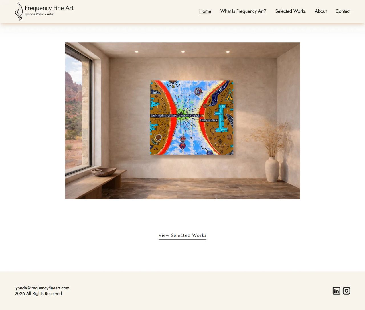
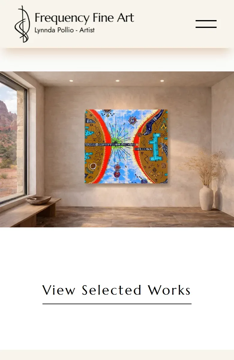
Artwork in situ. The home hero shows paintings on walls, in rooms. Photographs of paintings tell a collector almost nothing about presence: scale, how a piece holds a wall, what it does to a room. Lynnda generated the room settings; our work was compositing her paintings into them at correct perspective and scale, then cleaning up the result. Edge treatment and scale were the demanding part. Get either slightly wrong and the eye rejects the whole image without being able to say why.
Brand identity. We designed the Frequency Fine Art logo and wordmark, the signature anchoring the site and carrying across her outreach material. The constraint was obvious once stated: it sits beside work that is intricate and highly saturated, so it had to be present without asserting itself. Restrained and typographic. A mark that competes with the paintings is a mark that failed.
The interface. Black, white, ivory, deep charcoal. Colour is deliberately absent from the interface so that all of it comes from the work. A serif display face against a clean sans for body text. Tracking, sizing and negative space treated as primary decisions rather than inherited defaults, which is most of what separates a considered site from a configured one.
Infrastructure. Full Squarespace setup: domain configuration, DNS, SSL, site architecture. Five pages: home introducing Frequency Art, an explanatory page on the practice, the Selected Works gallery, biography and artist statement, and contact.
What we shipped
A custom gallery: single-work viewer, twenty-three works, structured caption data per piece. Paired-view support, so front/back and daylight/UV works display as one piece with two views. iOS-correct full-screen expansion, written against mobile Safari behaviour rather than around it. Tuned image delivery, with detail preserved at full-screen scale and the gallery responsive on mobile. Composited hero imagery, her paintings placed into her room settings at correct perspective and scale. A logo and wordmark, a restrained typographic identity built to sit beside saturated work. A five-page architecture with no commerce. Full platform setup: domain, DNS, SSL, structure.
Ongoing
The site is maintained as the body of work grows. New paintings get added and the gallery is reordered as the collection develops, which is the part of a presentation site most builds forget to plan for. A gallery that is painful to update becomes a gallery that stops being updated, and then it stops representing the artist.
The build is above. This is what the client made of it.
Following a bad experience on a freelancing platform, I found Abdul, and he rescued me. I had a clear vision for the simple, clean website I wanted to showcase my art, but knew nothing about website creation. Abdul understood my vision and, with great patience, guided me through the realities of bringing it to life on a deadline. He was responsive, capable, and proactive. His calming presence made the experience enjoyable. The site was exactly what I envisioned, and he has continued to support its evolution. I was lucky I found him.
Lynnda Pollio
Artist
Frequency Fine Art
Selected work
Settlebrook
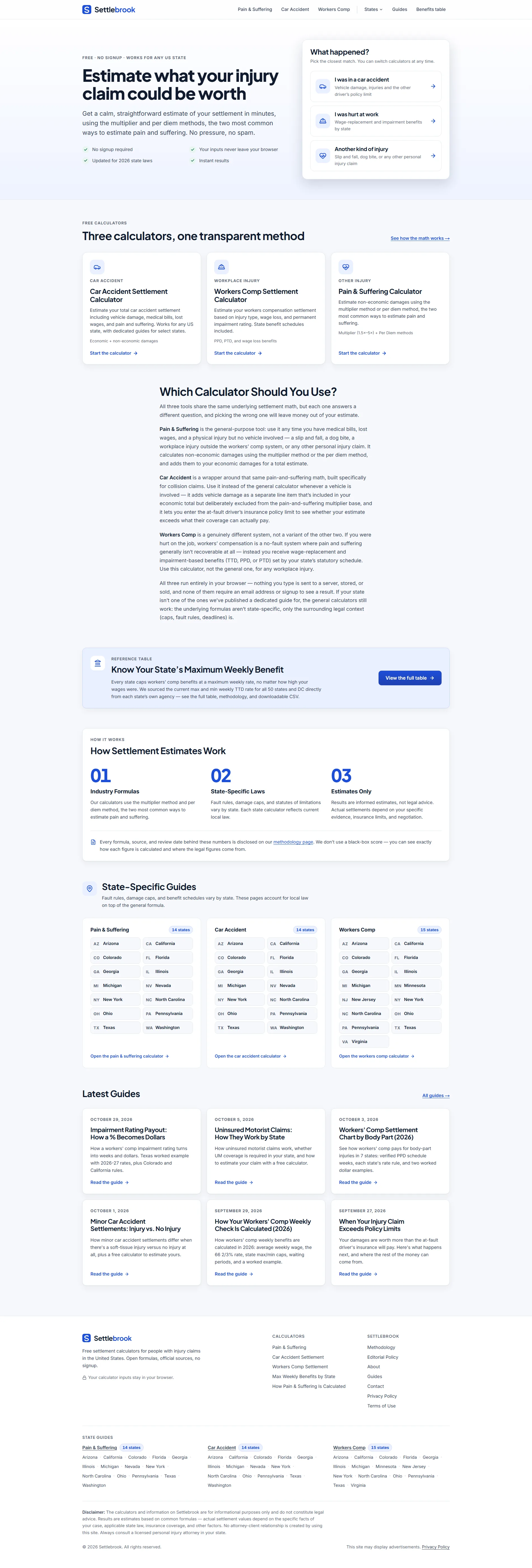
AI-powered web tool architected for organic acquisition, monetized through AdSense.
Dexign House
Structured data, internal linking systems and content-side technical fixes for a design studio.

Let's build something worth finding.
One brief. One reply within a working day. Evidence, not a pitch.
Or write to hello@rankingtank.com